
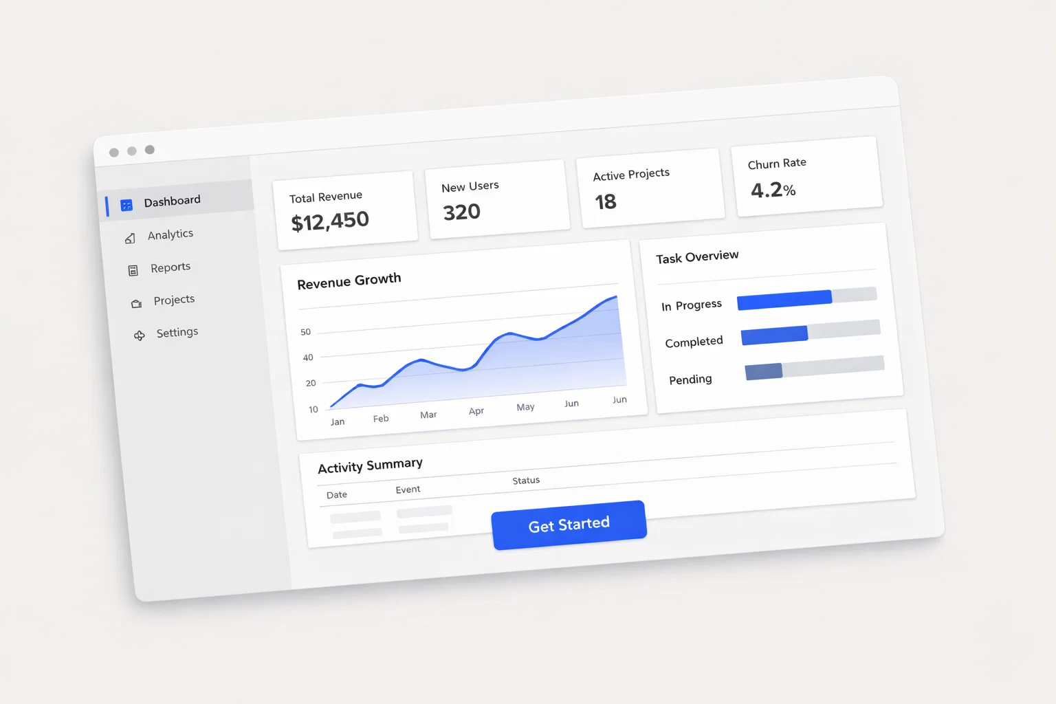
Designing a high-converting website to promote a mobile application is not merely an exercise in visual aesthetics. It is a highly structured process of conversion architecture and user experience (UX) design aimed at balancing user needs, business goals, and technical performance. For an app promotional website, the ultimate goal is frictionless routing: moving a user from initial curiosity to a successful app store download or web-based signup.
Achieving this requires deep intentionality. Website credibility and conversion are built through clear funnel mapping, transparent design rationale, and evidence-based interface choices. Modern app marketing relies heavily on minimizing cognitive load while maximizing trust signals and accessibility.
This guide provides a comprehensive, data-backed framework for designing app promotional websites using 2025–2026 UX standards, including mobile-first development, AI-driven personalization, Core Web Vitals, and WCAG 2.2 compliance.
1. Executive Summary: The Anatomy of a High-Converting App Website
A successful app promotional website operates as a high-efficiency conversion engine. The core difference between an average app landing page and a high-performing one lies in user routing and friction reduction. Users visiting an app promo site are typically looking for immediate value, social proof, and a seamless path to installation.
Data shows that a well-optimized app landing page can boost conversion rates by up to 300%. To achieve this, design strategies must align strictly with the target audience’s behavioral profile. The most impactful design levers include dynamic call-to-action (CTA) buttons, compelling app interface mockups, and immediate trust validation.
Key takeaways for app website design:
- Focus on zero-click behavior by placing the core value proposition and download buttons immediately above the fold.
- Utilize device-aware routing to serve the correct App Store or Google Play link automatically.
- Embed social proof directly next to primary conversion points to lower hesitation.
- Optimize for Core Web Vitals, as loading delays directly kill download intent.
| Design Element | Priority Level | Conversion Impact |
| Device-Aware CTAs | Critical | Directly dictates download funnel success. |
| Hero App Mockup | High | Visualizes value instantly, reducing bounce rates. |
| Trust Badges (Ratings) | High | Overcomes user skepticism and security concerns. |
| Feature Micro-Animations | Medium | Increases engagement and time-on-page. |
2. Psychological Drivers & Behavioral Patterns of App Seekers
Understanding the psychological triggers of your users is the foundation of effective UX design. Visitors to app promotional websites exhibit highly transactional behavior. Their attention spans are exceptionally short, and they are inherently skeptical of downloading unverified software onto their personal devices.
The typical user journey involves a rapid evaluation phase. Users ask themselves: “What does this do?”, “Is it safe?”, and “Is it worth my storage space?” Answering these questions within the first three seconds is critical. If the site fails to provide immediate clarity, users will abandon the session.
Mobile usage dominates this niche. Consequently, the threshold for trust is heavily reliant on visual polish and performance. A sluggish site or a broken layout instantly signals a low-quality app, destroying credibility before the user even reaches the app store.
| Behavioral Trait | High-Intent Visitor | Low-Intent Visitor |
| Scroll Depth | Scrolls to technical specs and reviews. | Bounces if hero section lacks clarity. |
| Interaction | Clicks video demos and interactive widgets. | Skims headlines and subheadings only. |
| Friction Tolerance | Will fill out a short lead-gen form. | Abandons at the first sign of friction. |
Behavioral characteristics of app site visitors:
- Instant Gratification: Expect immediate access to features without reading long text blocks.
- Visual Learners: Rely on UI mockups and short video loops rather than written descriptions.
- Socially Driven: Heavily influenced by App Store rating badges and user testimonials.
- Privacy Conscious: Hesitant to provide personal data without clear privacy reassurances.
3. Strategic Information Architecture for App Discovery
Information Architecture (IA) dictates how content is organized to reduce cognitive load. For an app promotional website, the IA must guide users effortlessly toward the download action. A shallow, flat hierarchy is strongly recommended over a deep, complex site structure.
Navigation should be strictly utilitarian. Avoid overwhelming the user with excessive menu options. The primary goal is to keep the user focused on the app’s core features and the conversion funnel. Internal linking should prioritize feature exploration and support pages that build trust.
Above the fold, content prioritization must be ruthless. Every element must either orient the user, build credibility, or propel them toward the CTA.
Recommended site structure for app promotion:
- Homepage: The primary landing pad containing the value proposition and primary CTAs.
- Features/How It Works: Detailed breakdown of app capabilities using interactive elements.
- Pricing/Plans (If applicable): Transparent cost breakdown to prevent app store sticker shock.
- About/Trust: Team background, security protocols, and comprehensive case studies.
- Support/FAQ: Knowledge base to address pre-download objections and technical requirements.
| Navigation Model | Pros for App Sites | Cons for App Sites |
| Single-Page (Flat) | High focus, linear storytelling, excellent for mobile. | Limited SEO real estate for distinct keywords. |
| Multi-Page (Deep) | Better SEO indexing, thorough feature explanations. | Risk of user distraction and funnel drop-off. |
4. Structuring the App Homepage for Maximum Impact
The homepage is the most critical asset in your conversion strategy. Every pixel must serve a distinct purpose. The hero section must instantly communicate the app’s unique value proposition (UVP) using a strong headline, a descriptive subheadline, and a prominent CTA.
Visual hierarchy is paramount. The eye should naturally flow from the headline to the app interface mockup, and finally to the download button. Scroll behavior should reveal progressive layers of detail, starting with high-level benefits and transitioning into specific technical features.
Trust signals must be injected early. Displaying “Featured by Apple” badges, security certifications, or impressive user statistics immediately below the hero section anchors the brand’s credibility.
Homepage must-have elements:
- Clear, benefit-driven headline (under 8 words).
- High-fidelity mockup or interactive device frame showing the app in action.
- Dynamic CTA that adapts to the user’s current operating system.
- A scannable list of top three core benefits.
- A dedicated social proof section with verified ratings.
| Homepage Section | Purpose | Conversion Role |
| Hero Area | Immediate orientation and value delivery. | Captures initial interest and drives instant clicks. |
| Social Proof Bar | Establishes baseline credibility. | Lowers perceived risk of downloading software. |
| Feature Highlight | Demonstrates core functionality. | Builds desire and justifies the download. |
| Final CTA Banner | Captures users at the end of the scroll. | Prevents bounce and offers a final conversion point. |
5. Conversion Mechanics: CTAs, Forms, and the Download Funnel
Analyzing the structural mechanics of conversion requires a focus on friction reduction. Call-to-action buttons should use contrasting colors to stand out from the background. The wording must be action-oriented and context-specific, avoiding generic phrases like “Submit” or “Click Here.”
In 2026, personalized dynamic routing is essential. If a user visits on a desktop, the CTA should generate a QR code for easy mobile scanning. If they visit on an iPhone, the button should link directly to the App Store, bypassing any intermediate steps.
For B2B or SaaS-based apps that require a web signup before downloading, form optimization is critical. Keep fields to an absolute minimum. Implementing social logins (Google, Apple) drastically reduces form abandonment.
Steps for app site form and CTA optimization:
- Implement Dynamic Routing: Use device detection to serve the correct OS-specific download link.
- Minimize Form Fields: Ask only for an email address or use single-click social authentication.
- Use Privacy Microcopy: Place a short privacy guarantee directly beneath the submit button.
- Design for the Thumb: Ensure all primary CTAs are easily reachable on mobile devices.
| CTA Type | Placement | Recommended Copy Style | Expected Impact |
| Primary App Store Link | Hero Section & Sticky Header | “Download on the App Store” | Drives the highest volume of direct installs. |
| Desktop QR Code | Desktop Hero Section | “Scan to Download” | Bridges the desktop-to-mobile gap. |
| Waitlist / Lead Gen | Mid-page or Footer | “Get Early Access” | Captures high-intent users prior to launch. |
6. Engineering Credibility: Trust Signals for App Promotion
Trust is the currency of conversion. For app promotional websites, establishing credibility is mandatory to overcome the inherent risk of malware or data privacy breaches. Trust signal architecture must be woven seamlessly throughout the user journey.
Industry-relevant indicators such as App Store rating badges (e.g., “4.9/5 stars from 10k users”), data encryption certificates, and recognizable press logos carry immense weight. These should not be hidden on a separate page; they belong on the homepage, near the primary conversion points.
For financial, health, or enterprise apps, a dedicated security or compliance section is non-negotiable. Displaying SOC 2 compliance, HIPAA adherence, or end-to-end encryption details reassures hesitant users and validates the app’s professional standing.
Implementation notes for trust architecture:
- Embed live App Store or Google Play review widgets to ensure authenticity.
- Highlight specific metrics (e.g., “Over 1 Million Downloads”) to leverage herd mentality.
- Feature a visible “Meet the Team” or “Backed By” section to humanize the software.
- Include clear links to Privacy Policies and Terms of Service in the footer.
| Trust Signal | Placement | Credibility Impact |
| Live App Store Ratings | Directly under the hero CTA | Very High — Proves existing user satisfaction. |
| Security/Compliance Badges | Near account creation forms | High — Alleviates data privacy concerns. |
| Press / Media Logos | Below the main fold | Medium — Borrows authority from established brands. |
7. Mobile-First UX: Designing for the Thumb Zone
Since the product is a mobile app, the promotional website will overwhelmingly be viewed on mobile devices. Designing for the mobile experience is the primary objective, not a secondary responsive afterthought.
Thumb-zone navigation principles dictate that interactive elements must reside in the lower half of the screen, where the user’s thumb naturally rests. Placing critical navigation or CTAs at the very top of a tall mobile screen creates physical friction.
Media optimization is equally important. Large video files or uncompressed mockups will destroy mobile loading times. Use CSS-based micro-animations and WebP image formats to keep the site lightweight while retaining visual appeal.
Mobile design checklist for app websites:
- Ensure primary CTAs are fixed to the bottom of the viewport (sticky footer).
- Size all tap targets (buttons, links) to a minimum of 44×44 pixels to prevent misclicks.
- Swap horizontal desktop layouts for vertical, swipeable card carousels on mobile.
- Disable auto-playing videos that consume mobile data without user consent.
| Design Element | Desktop Priority | Mobile Priority |
| Navigation | Expanded top-bar menu. | Hamburger menu or bottom tab bar. |
| Media Format | High-resolution interactive demos. | Lightweight, compressed micro-animations. |
| CTA Placement | Above the fold, center screen. | Sticky bottom banner within thumb reach. |
8. Core Web Vitals and the Business Impact of Speed
Technical performance is not just a developer concern; it is a direct business variable. In the highly competitive app market, a slow website signals a poorly coded app. Google’s Core Web Vitals (CWV) are critical benchmarks that measure loading speed, interactivity, and visual stability.
For app promotional sites, Largest Contentful Paint (LCP) must occur within 2.5 seconds. Because these sites rely heavily on high-resolution UI mockups and animations, aggressive image optimization and lazy loading are mandatory.
JavaScript bloat from third-party tracking scripts (analytics, heatmaps, ad pixels) is a common conversion killer. Developers must defer non-essential scripts to ensure the site becomes interactive immediately. A faster site not only retains users but also improves organic search rankings.
Quick-win performance optimizations:
- Convert all app screenshots and hero images to next-gen formats (WebP/AVIF).
- Implement lazy loading for images and videos below the fold.
- Minimize main-thread work by delaying non-critical third-party JavaScript.
- Utilize a Content Delivery Network (CDN) to serve assets globally with low latency.
| Performance Metric | Target Benchmark | Conversion Impact |
| Largest Contentful Paint (LCP) | < 2.5 seconds | Prevents immediate user bounce. |
| First Input Delay (FID) / INP | < 100 milliseconds | Ensures buttons feel responsive and premium. |
| Cumulative Layout Shift (CLS) | < 0.1 | Prevents accidental clicks and user frustration. |
9. Aligning SEO and Content with the App Download Intent
Search-optimized content and UX must work together harmoniously. App landing pages often struggle with SEO because they rely heavily on imagery and sparse text. However, integrating targeted, intent-driven copy can capture valuable organic traffic without cluttering the interface.
On-page SEO should align with the user’s search intent. Use H1, H2, and H3 heading hierarchies to structure the content logically. This improves readability for users scanning the page and provides clear context to search engine crawlers.
To build topical authority, support the main promotional page with a dedicated blog, feature deep-dives, or use-case hubs. Schema markup specifically tailored for software applications (SoftwareApplication schema) should be implemented to display rich snippets directly in search results.
SEO and UX alignment checklist:
- Use clear, descriptive headings instead of vague marketing jargon.
- Implement SoftwareApplication structured data to show app ratings in Google search.
- Ensure alt text is descriptive for all app interface mockups.
- Create dedicated landing pages for specific use cases or audience segments.
| Content Format | SEO Role | Conversion Role |
| Feature Deep-Dives | Targets long-tail feature keywords. | Educates high-intent users on specific capabilities. |
| Case Studies | Ranks for industry-specific queries. | Provides verifiable social proof. |
| Knowledge Base | Captures “how-to” search traffic. | Reduces pre-download friction and support tickets. |
10. Inclusive Design: WCAG 2.2 Compliance as a Growth Lever
Accessibility is both a legal requirement and a significant conversion driver. Complying with Web Content Accessibility Guidelines (WCAG) 2.2 ensures that your app promotional site is usable by the broadest possible audience. Data indicates that accessible design can increase conversion rates by 10-50% through clearer navigation and form structures.
Inclusive design requires strict adherence to color contrast standards, ensuring that text is easily readable against background images. Furthermore, the site must be fully navigable using a keyboard, and screen reader compatibility must be maintained through proper ARIA labels and semantic HTML.
Ignoring accessibility not only alienates a portion of your target market but also exposes the business to legal risks. A site that is easy to navigate for users with disabilities is inherently easier to navigate for everyone.
Accessibility compliance checklist:
- Ensure a minimum color contrast ratio of 4.5:1 for normal text.
- Provide descriptive alt text for all meaningful images and UI mockups.
- Ensure all interactive elements are reachable via keyboard (Tab navigation).
- Avoid relying solely on color to convey critical information (e.g., error states).
| Accessibility Element | WCAG Standard | Risk if Ignored |
| Color Contrast | 4.5:1 ratio (AA level) | Users with visual impairments cannot read copy. |
| Keyboard Focus | Visible focus indicators | Motor-impaired users cannot navigate the site. |
| Form Labels | Explicit <label> tags | Screen readers fail to convey form purpose. |
11. Data-Driven Evolution: Heatmaps, Analytics, and CRO
Post-launch data must drive continuous design improvements. An app promotional website is never truly finished; it requires ongoing Conversion Rate Optimization (CRO) based on real user behavior.
Track key metrics such as impression-to-page-view rates and page-view-to-install rates. For context, the average page-view-to-install conversion rate in app stores hovers around 25% to 27%. If your web-to-app conversion is drastically lower, funnel drop-off analysis is required.
Heatmaps and session recordings provide invaluable qualitative data. They reveal where users are clicking, how far they scroll, and where they encounter friction. A/B testing should follow a rigorous framework: test one variable at a time, such as CTA placement or hero messaging, to isolate the exact cause of performance shifts.
CRO testing process:
- Identify Leaks: Use analytics to find pages with high bounce rates or low CTRs.
- Formulate Hypotheses: Use heatmap data to guess why users are dropping off.
- Create Variations: Design a challenger page that addresses the suspected friction.
- Run A/B Tests: Split traffic evenly until statistical significance is reached.
- Implement and Iterate: Roll out the winning variation and begin the next test.
| Tool Category | Use Case | Insight Type |
| Heatmaps (e.g., Hotjar) | Tracking scroll depth and click patterns. | Qualitative visual data on user attention. |
| Web Analytics (e.g., GA4) | Measuring traffic sources and bounce rates. | Quantitative data on user acquisition. |
| A/B Testing (e.g., Optimizely) | Testing headline variations and CTA colors. | Direct impact on conversion metrics. |
12. Fatal UX Flaws That Choke App Downloads
Certain design patterns actively destroy trust and sabotage conversion rates in the app niche. The most common error is failing to immediately clarify what the app does. Relying on overly abstract imagery or vague copywriting forces the user to guess, leading to an immediate bounce.
Another fatal flaw is poor mobile routing. Asking a mobile user to fill out a complex web form instead of deep-linking them directly to their respective app store creates unnecessary friction. Additionally, bombarding users with aggressive pop-ups or full-screen interstitials before they have extracted any value destroys the user experience.
Performance failures, such as unoptimized autoplaying videos that freeze mobile browsers, directly contradict the perception of a premium digital product.
Common app website UX mistakes:
- Hiding app interface screenshots behind vague, stock-photo graphics.
- Failing to use dynamic OS-specific download links.
- Burying pricing or subscription requirements, leading to app store abandonment.
- Cluttering the mobile view with complex, multi-level dropdown menus.
| Fatal Mistake | Negative Impact | Recommended Alternative |
| Generic “Download” CTA | Creates confusion on desktop devices. | Dynamic routing (QR codes for desktop). |
| Vague Hero Messaging | High bounce rate within 3 seconds. | Clear, benefit-driven headline + App Mockup. |
| Heavy Video Backgrounds | Ruins Core Web Vitals and mobile UX. | Lightweight WebP images or CSS micro-animations. |
13. Cross-Industry UX: Borrowing Strategies from SaaS and E-Commerce
App promotional websites can significantly benefit by adopting proven UX conventions from adjacent digital industries. While app sites are unique, they share behavioral overlap with both B2B SaaS and consumer E-Commerce.
From SaaS, app websites should adopt the “Feature-to-Benefit” translation model. Instead of just listing technical specs, pages should clearly articulate the business or personal value, backed by a strong onboarding flow design. Interactive product tours, common in SaaS, can be adapted into swipeable interactive mockups for app sites.
From E-Commerce, app sites should borrow urgency mechanics and streamlined checkout principles. For apps requiring a web-based subscription before downloading, applying e-commerce cart optimization techniques—like progress bars, security badges, and minimal form fields—will drastically improve completion rates.
Transferable insights from other industries:
- From SaaS: Transparent pricing tables and extensive knowledge bases.
- From E-Commerce: Scarcity triggers (e.g., “Limited Beta Access”) and streamlined checkout UX.
- From Healthcare: Extreme emphasis on data security, HIPAA compliance, and privacy policies.
| Industry | UX Convention Borrowed | Application for App Websites |
| SaaS | Interactive Product Tours | Web-based interactive app mockups. |
| E-Commerce | Frictionless Checkout | Streamlined web-to-app account creation. |
| Fintech | Bank-Grade Security Signals | Prominent privacy and encryption badges. |
14. Phased Execution Roadmap for App Website Launches
Executing a high-converting app website requires a disciplined, phased approach. Jumping straight into high-fidelity design without a foundational strategy guarantees structural flaws.
The process must begin with defining clear Key Performance Indicators (KPIs), such as cost-per-acquisition (CPA) and impression-to-install rates. From there, user journey mapping ensures that all audience segments—whether arriving via social media ads or organic search—are routed correctly. Only after the wireframes and sitemap are validated should visual design and development commence.
Website implementation roadmap:
- Strategy & Goal Setting: Define target audience, conversion goals, and primary KPIs.
- Information Architecture: Develop the sitemap and define the page hierarchy.
- Wireframing: Create low-fidelity layouts prioritizing CTA placement and content structure.
- UI Design & Prototyping: Apply branding, design high-fidelity mockups, and define micro-interactions.
- Development & Optimization: Build the site prioritizing mobile-first CSS and Core Web Vitals.
- QA & Accessibility Testing: Verify WCAG 2.2 compliance and test cross-device functionality.
- Launch & Baseline Measurement: Deploy the site and establish baseline conversion metrics.
- Continuous Iteration: Run A/B tests based on heatmap and analytics data.
15. Appendix: App Promo UX Metrics, Benchmarks, and Toolkits
To accurately gauge the success of an app promotional website, one must understand industry benchmarks. The conversion rate from an app store page view to an actual download averages 25% for iOS and 27.3% for Google Play.
For web-based landing pages routing to the app store, a successful click-through rate (CTR) to the store typically ranges from 8% to 15%, depending on the traffic source’s intent. Utilizing the right technology stack is essential for monitoring these metrics and executing design improvements.
Recommended tools for app website design:
- Design & Prototyping: Figma, Framer, Webflow.
- Analytics & Tracking: Google Analytics 4, Mixpanel, AppsFlyer (for web-to-app attribution).
- CRO & Heatmaps: Hotjar, Crazy Egg, VWO.
- Accessibility Testing: Lighthouse, WAVE Web Accessibility Evaluation Tool.
| Metric | Industry Benchmark | Indication |
| Store Page View to Install | 25% – 27% adapty+1 | High relevance and strong store listing. |
| Web Bounce Rate | 45% – 60% | Normal range for paid acquisition traffic. |
| Average Session Duration | 1 – 2 Minutes | Indicates sufficient time to read value props. |
Frequently Asked Questions About App Promo Website Design
How do I handle CTAs for desktop users when my product is a mobile app?
Implement dynamic routing. Detect the user’s device and display a QR code on desktop screens. This allows users to scan the screen with their phone and be taken directly to the appropriate app store.
Do I really need a multi-page website for an app?
Not necessarily. For single-function apps, a long-scrolling single-page site is often more effective. Multi-page sites are better suited for complex SaaS apps that require extensive documentation, feature breakdowns, and SEO hubs.
What is the ideal placement for App Store and Google Play badges?
Badges should be placed above the fold in the hero section, integrated into the sticky navigation bar, and repeated at the very bottom of the page in a final conversion banner.
Should I include a web-based signup form or send users straight to the app store?
If your app requires payment or complex onboarding (like B2B SaaS), web-based signup is often better. If it is a free consumer app, send them straight to the app store to minimize friction and maximize download volume.
How does WCAG compliance affect my conversion rate?
Accessible design improves usability for everyone. Clearer forms, higher contrast, and better semantic structure can increase overall conversion rates by up to 50% by removing unintended friction.
How many features should I highlight on the homepage?
Focus on the top three to four core features. Overwhelming the user with a massive feature list increases cognitive load. Use a dedicated “Features” page for detailed technical breakdowns.
To ensure this guide perfectly aligns with your specific product, are you designing a promotional site for a free consumer app (B2C) or a paid/subscription-based enterprise app (B2B)?